

Information Architecture
Vitl Navigation Bar
Objective:
Vitl’s navigation bar needed to be re-designed because Vitl wanted to launch more products and the their current nav wasn’t flexible enough to accommodate that. We found some additional UX issues, so we wanted to take the opportunity to address and improve that at the same time.
The team I worked with:
Product manager, Head of Marketing, Head of Teach and Developers and Copywriters.
My Role:
I was responsible to investigate and research the problem. And to understand clearly what are the product objectives. I’ve run a workshop with key stakeholders in order to gather all insights from a business perspective. I’ve presented the design exploration and the different ways the navigation could be approached visually, creating wireframes, prototypes and final design.


Discovery
I’ve asked existing users to find products based on their needs on the platform. They were navigating easy but they found the journey quite long.
The purpose of the Navigation Bar is to allow people to navigate easily between products and pages on the platform while ensuring that they are able to retain a good understand of Vitl’s overall proposition.
The problem
Current users and business issues
● The navigation bar is not flexible enough to add more products to sell as the structure is fixed
● The products are displayed as disconnected, discrete offerings, rather than as part of an integrated ecosystem
● It takes a long time to get to the right product - for example for Essential One from the home page, you have to click: Vitamins -> scroll down -> Find out more -> view the page.
● Within My Vitl, the navigation bar is inconsistent with the page content - this may be an issue
● Take Consultation vs. Start Now vs. Start labelling generally is not consistent across pages and platforms
● Current CTAs are not appropriately named - e.g. what does ‘DNA’ mean to a new customer in isolation

Open Cards Sorting
Information Architecture Workshop
Why:
The reason I’ve decided to organised the workshop was because I believe in collaborating and aligning everyone on the same page is essential. This can help we pull out the necessary information and also to hear all different perspectives from across an organisation. And also prevent further back and forth later in the project.
How:
Creating a clear structure and goal. And articulating it clearly at the beginning of the workshop. I’ve brought all key stakeholders who represent different teams from the business to play the Open Cards Sorting to solve and understand the problems listed in the brief. We look at all research and findings from the past and I’ve asked them key questions that could help us organise the information structure from the user and the business needs.
How did it go:
All participants contributed and while answering the questions, we were playing with the cards and organising them by user and business needs level of importance. We’ve managed to come up with solid structure and analysing which products are priorities.
Outcome
At the end of the workshop, we’ve gathered much more clarity and better vision of how to measure the success of this project. I had clear idea of how to tackle the challenge and how to prioritise and structure the overall structure

Solution Exploration
Sometimes I prefer to sketch directly digitally because it helps me to organise my thought faster and ideas.
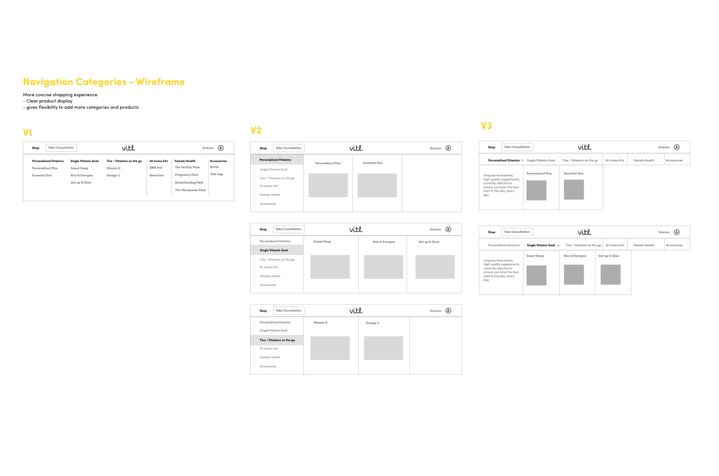
I’ve explore 2 different mega menus. From more simple and concise listing style, that will give the product flexibility to add as many products in the future and another version with more visual approach.

Wireframing
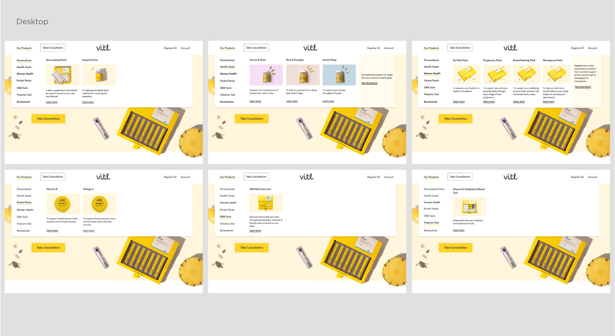
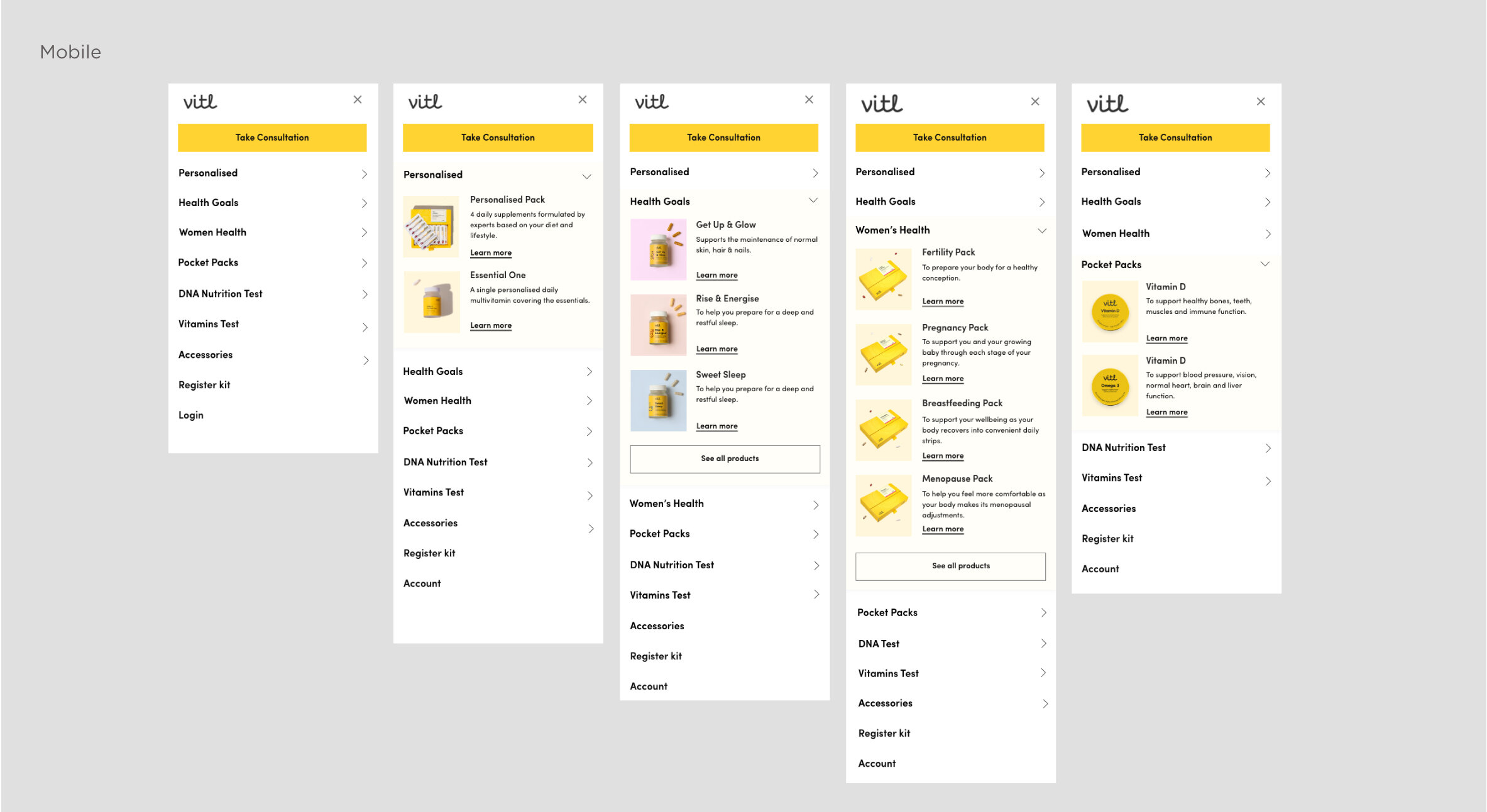
The Design
The final design is using flexible visual components that will allow customers to get quick understanding of what are the products about. Under each listed product I’ve decided to keep a very short summary about the product so people can get quick understanding of what is the product about. The new structure allows to expand the overall site, if necessary. And allows customers to navigate easily and understand what is the overall product proposition.


Visit the Site →
UI Design - Romina Nikolova
Content writer - Jessica Simms
Project Lead - Josefina Garat
Front End Development - Bogdan Prigorie