
Health Goals Product Pages
UI / Art Direction
OBJECTIVE
The requirement was to create a new category page and individual product pages for the new products. Creating flexible designs that will allow them to list many products to sell, but also to provide clarity and show the benefits of the products.
TEAM I WORK WITH
Project Manager, Marketing lead, Copywriter, Content Creators, Front-end developers, Photographers, External agency
RESPONSIBILITIES
UI and Art Direction - Identifying the problem with the current category and individual product pages by analyzing previous research and understanding where are the main UI problems
I’ve prototyped and designed new components that I’ve presented to the project stakeholders’ review meetings. I was working very closely with the front-end developer, discussing the new feathers, components, and changes we wanted to make on the front-end side. Collaborating with the content-creative on concept ideation for the new products art direction shooting. And briefing together our external agency on executing the concepts.
Challenges
The existing category components weren’t flexible enough and didn’t have the best UX practice Such as giving the flexibility to list many products and making the user journey easy to navigate and find products.
The listing modules were using huge images and blocks of text to display many products on the page, which was making the browsing longer. From all of the data and research we’ve collected we knew that people didn’t scroll to the bottom of the pages, and that was affecting the product metrics. And people could miss finding products they might need or be interested in purchasing.
Content structure: the product description pages didn’t include modules that could showcase the benefits of the products.
How do we display the products’ long list of ingredients in an engaging, understandable, and concise way?
Old Category Product Page Components - Analysis

Approach
RESEARCH & WIREFRAMES
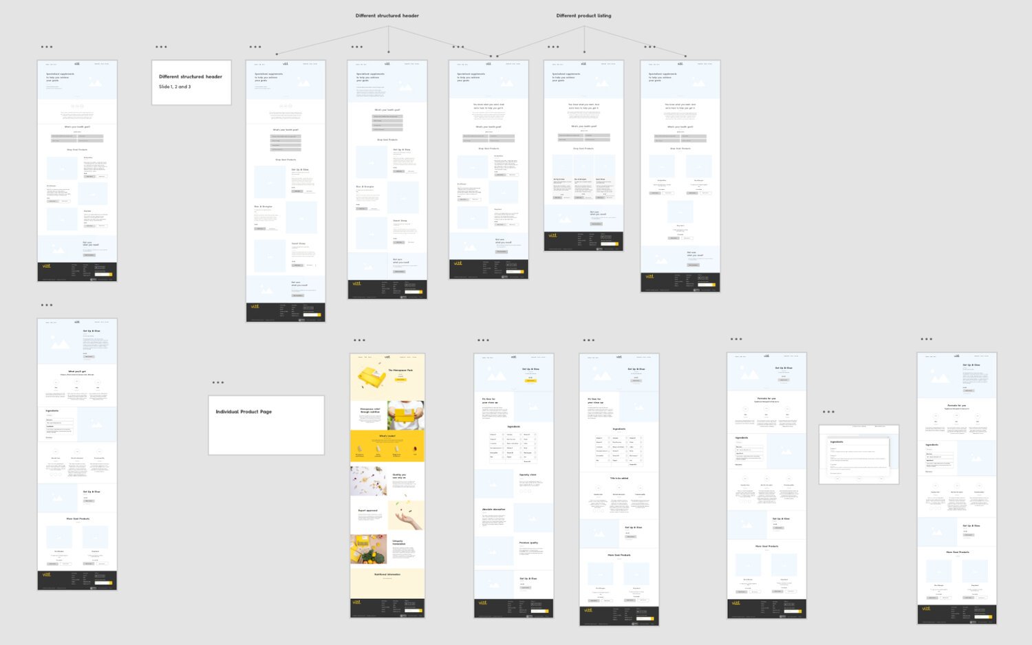
Using Hotjar insights and previous user testings of how people are browsing on the platform and knowledge of what will drive customers’ attention and interest, I Sketched and wireframed different ways of structuring the information of the page. For the category’s page, I’ve wire-framed 2 different design approaches. One that is using tweaking and adapting the existing listing modules and another one that is using new modules that are more flexible for e-commerce experience and it will allow the product to list.
CONTENT STRUCTURE
Collaborating with the marketing copywriters we brainstormed the content structure taking into account findings of what information people will find valuable. But also checking with nutritions geneticists advise on what information people need to know the most.
Ideation - Prototype

I’ve presented to the wider team two main concepts to approach the problem:
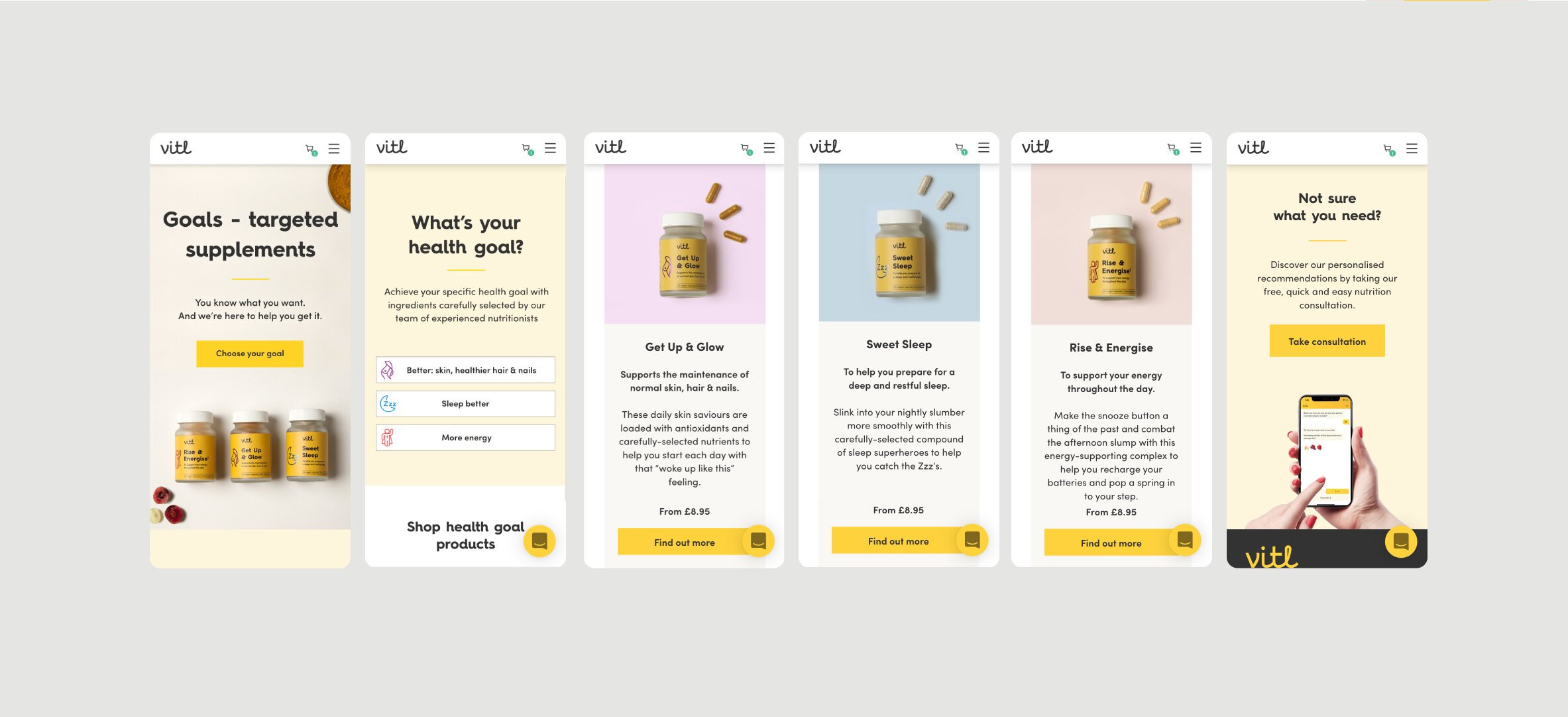
CATEGORY PAGE
OPTION ONE - Product page layout using tweaked and improved existing modules with reduced unnecessary white empty space and image size. OPTION TWO - Introducing new listing product components to improve the browsing product experience and flexibility to list more products later on.
INDIVIDUAL PRODUCT PAGES
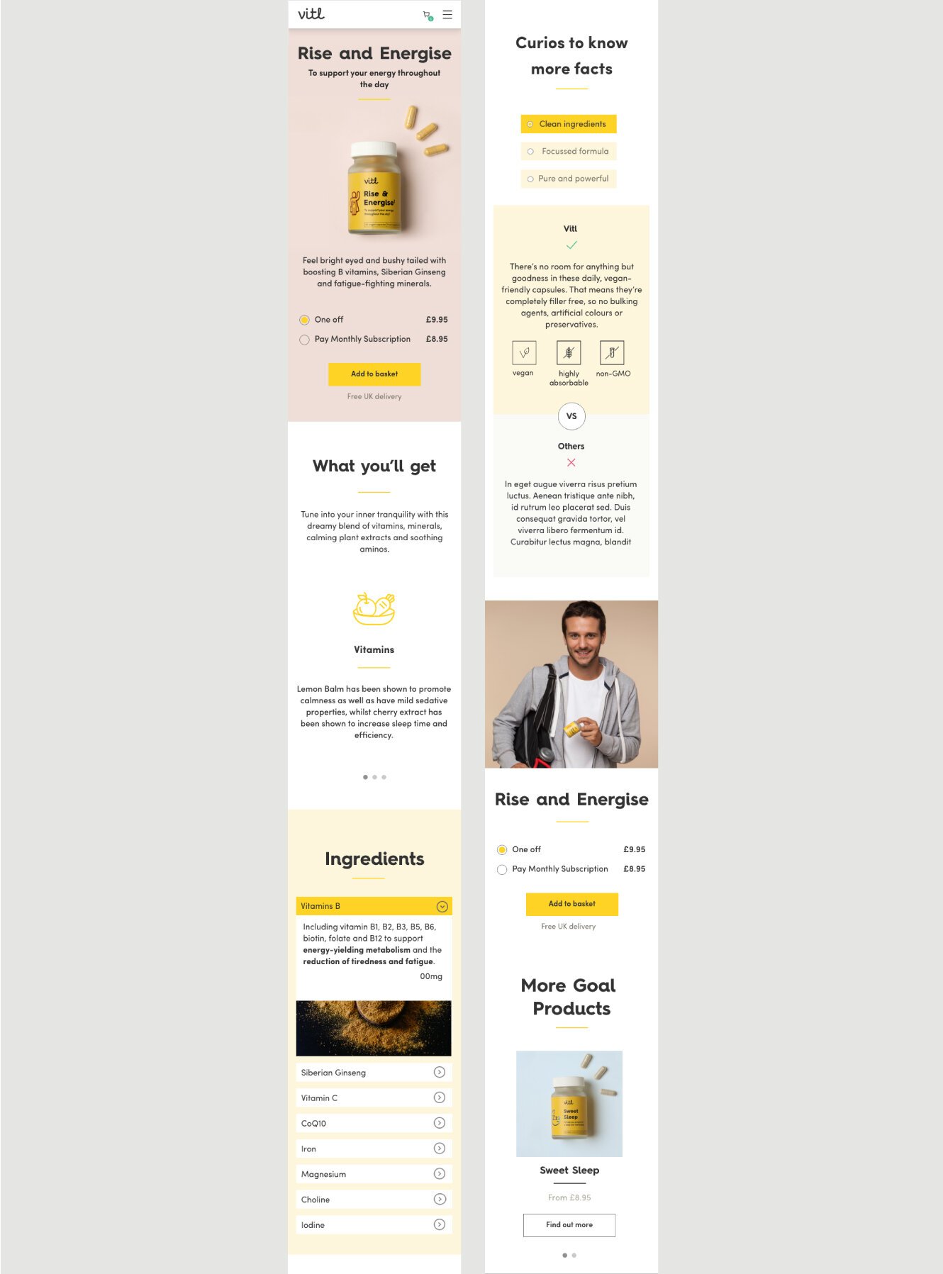
Here you can see a clear example that the pages had the same structure and I was looking at introducing a new component for showing the ingredients I’ve designed a few different options to approach it.
THE CHALLENGE
was that sometimes the products had more than 20 ingredients to list and I had to find a way to present this type of information very concise and visually appealing.

The key part of the Ideation process
COMPARING THE VARIATIONS OF THE COMPONENTS
The crucial part of the ideation process was to find a way to design a new module to display all of the ingredients in a way that won’t feel overwhelming for the users and will be visually appealing at the same time. I’ve explored a few different ways to approach this problem while sharing it with our front-end developer to ensure it can be easily implemented. The goal was to achieve the most straightforward experience.
Final UI
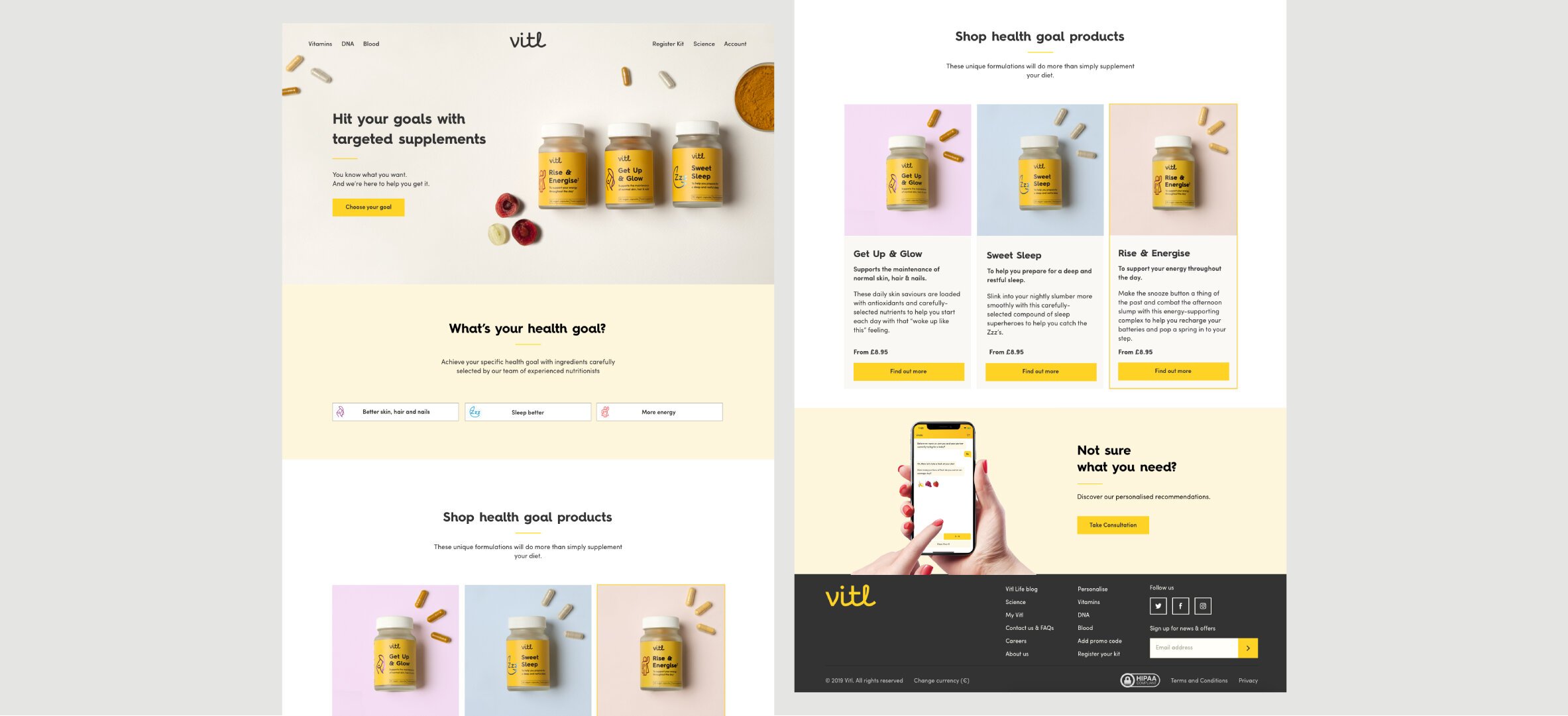
CATEGORY PAGE
After collecting key stockholders’ feedback, and testing the design between us within the team, that the best direction moving forward was to choose to introduce new product listing modules for the categories page. I’ve tweaked and adapted the modules so the product are listed in a more flexible components that will allow us to list as many products as necessary.
I’ve run few meetings in which I’ve presented the key design aspects, and also reviewed the designs with the key stakeholders (CCO, Product manager, Head of Tech, Developers, and Head of Marketing and the Copywriter)
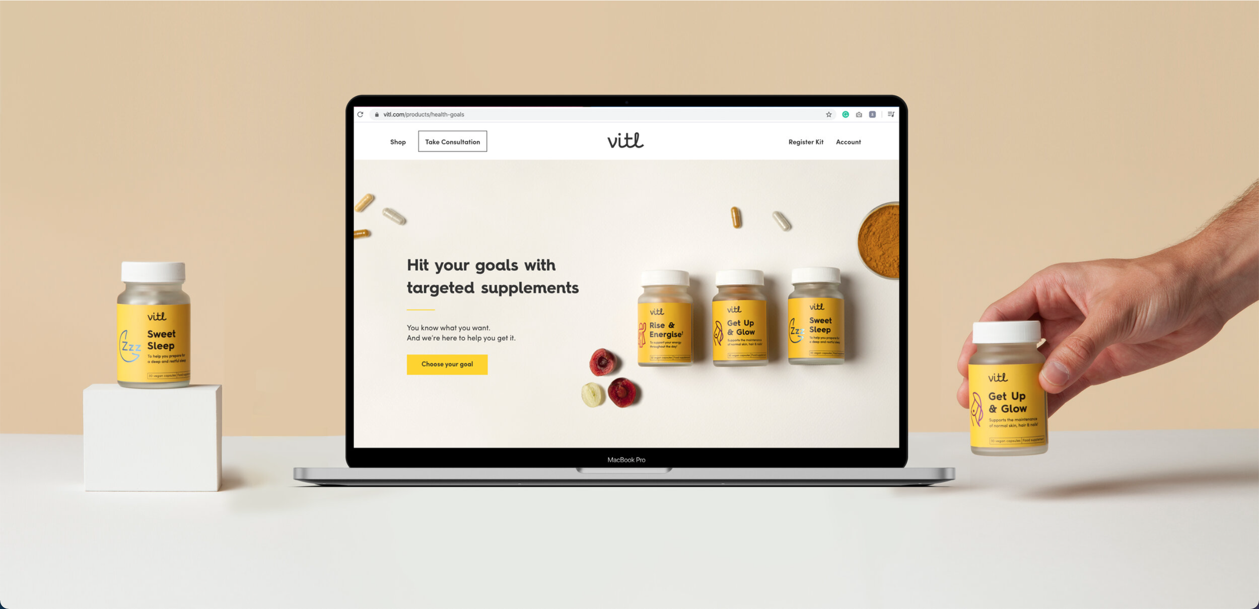
Category Page - What is your goal
Listing all products with the new products cards

Solution
Based on previous research, observing the tests of how people are browsing on the platform, and collecting key stockholders’ feedback, I’ve decided that the best direction moving forward is to introduce new product listing modules for the categories page. I’ve tweaked and adapted the modules so the product has a more flexible design and allows them to list as many products as necessary.
I’ve run a few meetings in which I’ve presented the critical design aspects and also reviewed the designs with the key stakeholders (CCO, Product manager, Head of Tech, Developers, Head of Marketing and the Copywriter)
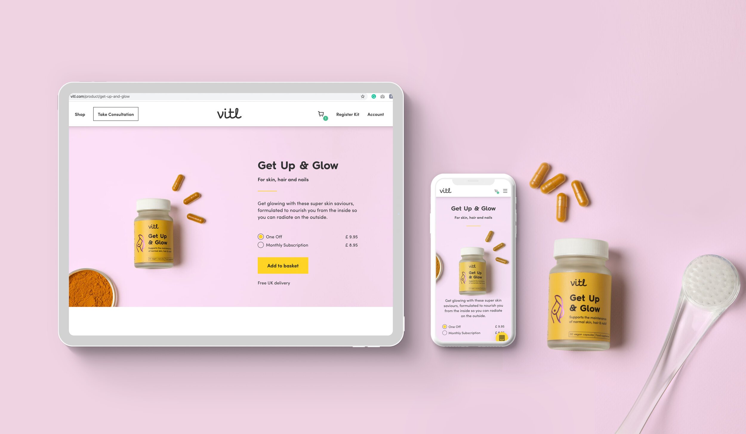
The individual product pages are structured in a storytelling narrative approach, using the following content frames:
Into, Name & Price >> Intro what is the product about >> Ingredients “because this what makes it unique” >> How is different than other products >> aspirational-lifestyle component and price. >> cross-sell functionality “other recommended products”
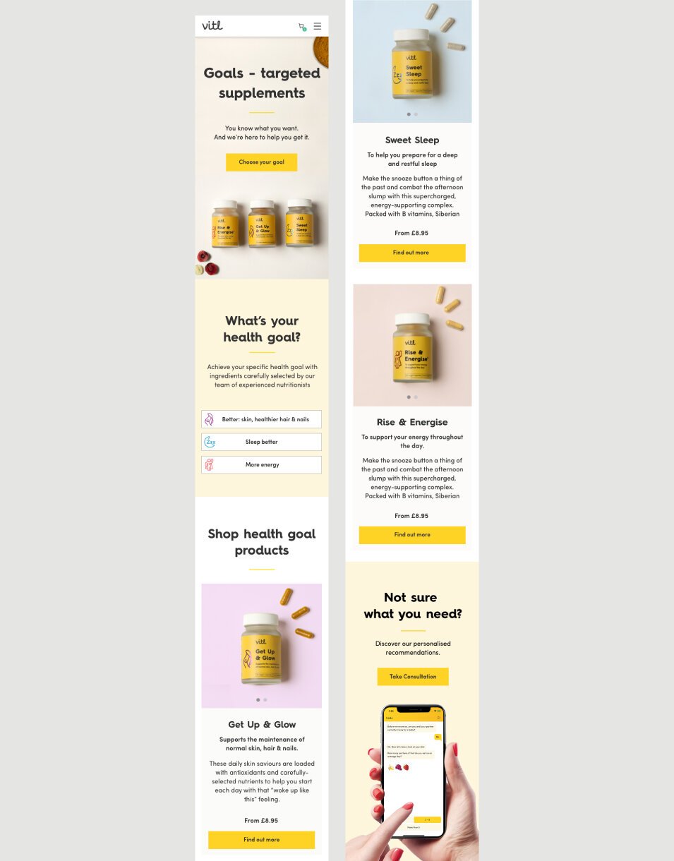
Individual Product Pages
INDVIDUAL PRODUCT PAGE
The final individual product pages are identical, following the same structure and layout. I aimed to achieve a straightforward, minimalistic design that will allow people to quickly understand what the products are about and give the flexibility to show all the ingredients in a simple interactive component feature.
CONTENT FETURES STRUCTURE
The individual product pages are structured in a storytelling narrative approach, using the following content frames:
Into, Name & Price >> Intro what is the product about >> Ingredients
"Because this is what makes it unique">> How is it different from other products aspirational-lifestyle components and price? >> cross-sell functionality "other recommended products."


Product Launch - outcome
The new product web launch was supported by a campaign to run from the launch date. And most of the traffic was coming from online ads.
Most people were buying the one-off option rather than subscribing, and metrics were increasing every following week.


UI Design - Romina Nikolova
Art Direction - Romina Nikolova / Alena Nelson / VEO
Shooting - VEO
Content writer - Jessica Simms
Photo retouching - VEO agency
Project Lead - Micha Patel & Josefina Garat
Front End Development - Bogdan Prigorie