
Roche Ophthalmology - disease awareness website
Agency
BBH - Bartle Bogle Hegarty
Client
Roche Ophthalmology
Roche is the world's largest biotech company and the Future of vision site is part of their global disease education awareness campaign which is split into 3 parts
- introducing the Roche Ophthalmology franchise and focus. Setting up the unmet need around treatment burden
- the reality of retinal disease - Setting up the unmet need around treatment burden
- The hidden predator - High-level introduction to Ang2 as the hidden predator in retinal disease
Summery
“I helped shape Roche Ophthalmology, the disease awareness website, and components’ design system using atomic design principles”
My Role
UI Designer
Wireframing
Web Design
Design System
Brand design development
Team I worked with:
Project Manager, Creative team, Front-end developers, External agency
Tools
Sketch, InVision, Zeplin
Adobe Illustrator / Photoshop
Completed
2020 - 2021

Context
Roche is an Ophthalmology company, passionate about saving people's eyesight from the leading causes of vision loss. They are pioneering clinical programmes focus on some of the main causes of blindness and visual impairment globally, where the unmet need is high diseases of the retina.
They are on a mission to deliver new innovation for treating vision lost.
The Window to Change is their unbranded campaign created before they officialy announce their innovative treatments and technologies for vision lost. As well as addressing the leading causes of vision loss


Brief
To explore ways of how we communicate Roche’s role in Ophthalmo as well as integrating the unbranded campigns (FRANCHISE - UNMET NEED)
Project Goals
EDUCATE AND AWARENESS
How to bring awareness about retinal deceases , so Roche can be further established as leader in the biotech company.
To visually guide the user through the product’s interface.

Concepting
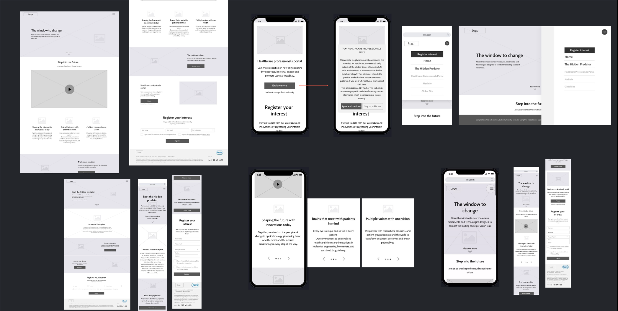
Following the given structure of the planned content, I wireframed iteratively to define the information architecture of screens. I also explored various navigation approaches to determine the best experience for the user.
I collaborated with with the strategist, the art director and the copy writer (The creative team of the campaign) to present to Roche’s stakeholders way to validate concepts and gather feedback to continue improving the experience.

Ideation
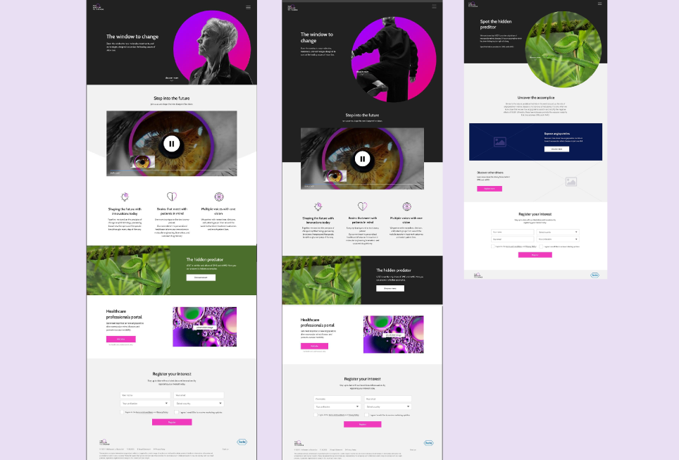
Roche’s another campaign (Spot the hidden predator) was planned to go at the same time which had to be integrated into the Widow to Change website. And the challenge was how to integrated it to fit in visually within the Window to change stylistics.
We had to present how we would translate the campaign visual identity to atomic design system page layouts, for the awareness digital platform, so we can easily build more pages in later on. The plan was within the next few months to create 10 more pages that will give in dept information about the disease causes by the eye
I started exploring and defining the colours strategy for the form labels, inputs, buttons, etc. aiming to design cohesive and intuitive digital experience.

Design Solutions
The design transfers the brand’s strengths and visual assets to a product’s interface, making sure the design is consistent, coherent, and aesthetically pleasing. The components’ architecture design approach is very minimalistic in sync with visuals that can help people read and understand the content easily.
Design
Aside from creating a clean aesthetic intuitive experience that would resonate with the target audiences of patients and health care professionals - it was also important to craft a design system in line with atomic design principles. That would balance a diverse range of aesthetics throughout all pages on the global website, allowing the individual campaigns to have their components, and to allow us easily scale the website and for better efficiency, and consistency in Design.

Design System
Design Systems are like a living organism in that they complex and ever evolving. What I showed here is just a section of what goes into a complete system.
THE TYPOGRAPHY
The brand was designed to use very bold and condensed typeface to create bold visual identity. But when it comes to web I had to find an alternative typeface that we can use for the headings and at the same time to achieve the same visual experience. The best solution for that would be to stick with the font used predominately for the body content, Barlow. It's also super versatile having several variations in weight which makes it look great as a heading font and as body text.
TOGGLE FUNCTIONALITY
Design systems are complex and here are the examples of few of the components that I've done so far.

Medical illustration creation

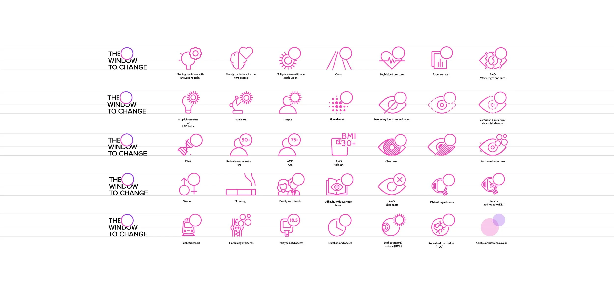
Iconography

Final MVP
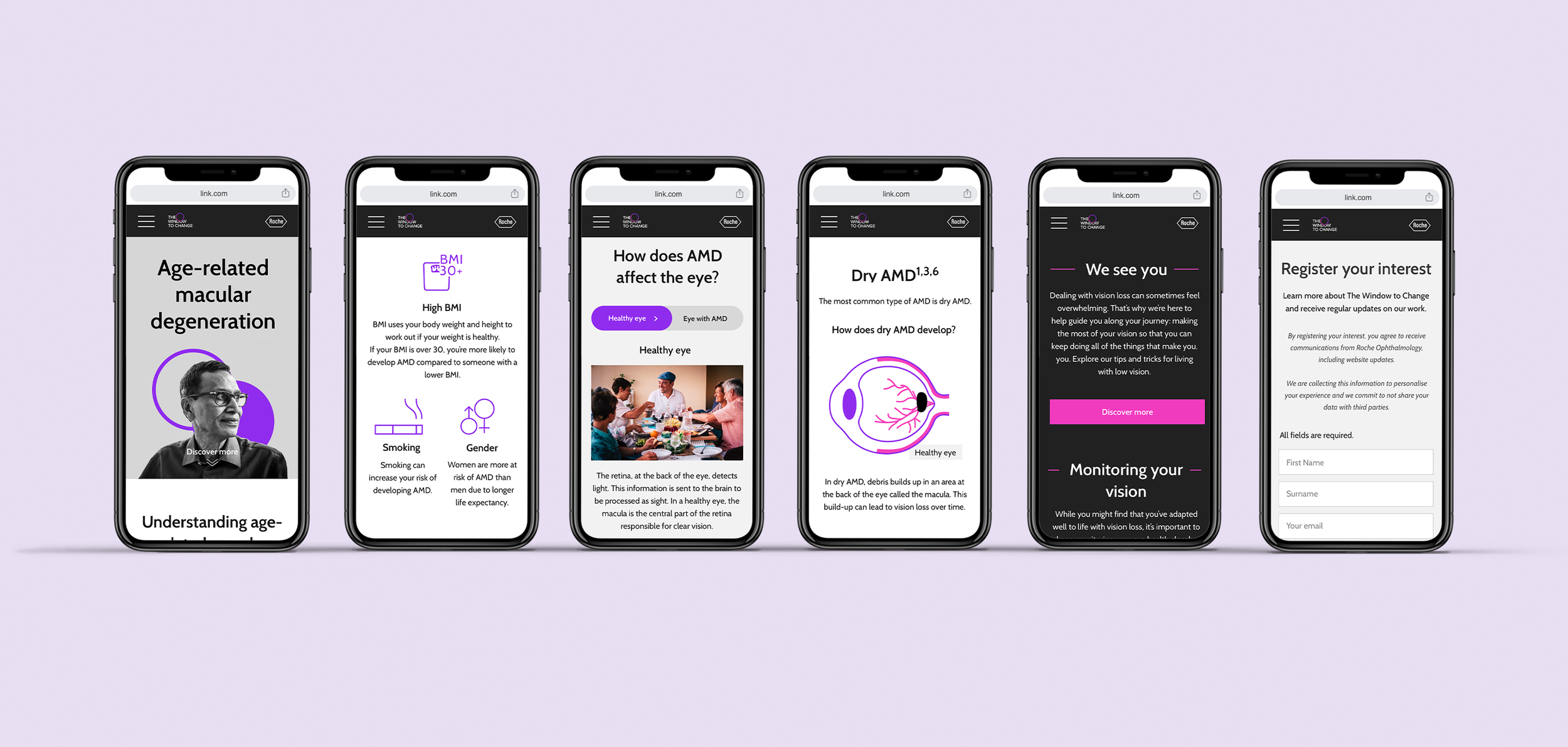
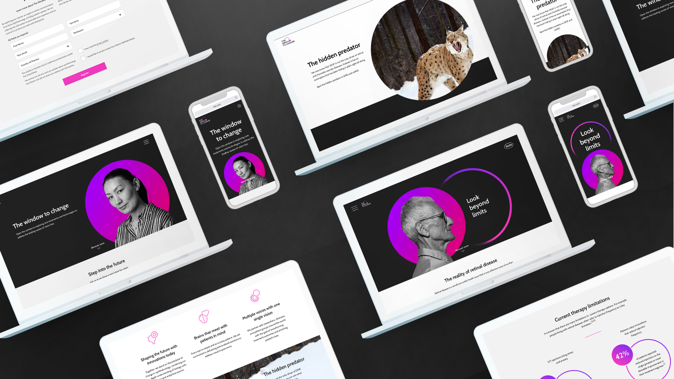
Responsive platform for patients and healthcare professionals who can learn about vision impairment and sign up to get the latest news about ophthalmology treatments and discoveries. The design uses the Window to Change brand elements with a minimalistic and simple approach to achieve a consistent and intuitive experience.


